From drop-off data to activation design
Plum needed to turn sign-ups into savers — redesigning the first experience for 2M+ users across 10 markets.
Featured talk: Presenting learnings from this work at UX London 2026
Plum needed to turn sign-ups into savers — redesigning the first experience for 2M+ users across 10 markets.
Featured talk: Presenting learnings from this work at UX London 2026
Plum was growing fast — 2M+ users across 10 markets, £6.7M revenue in 2024 — but the onboarding funnel had a problem hiding in plain sight.
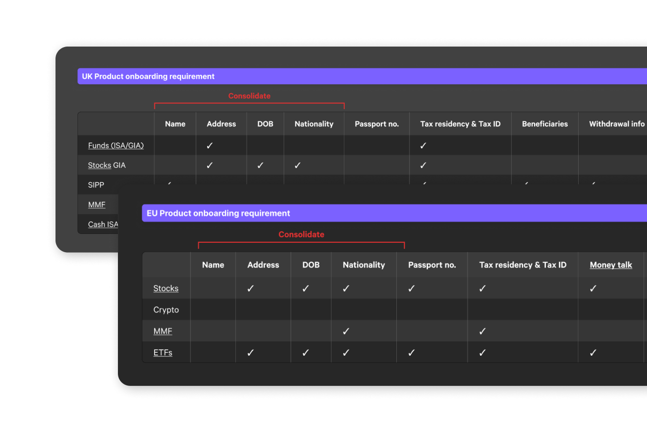
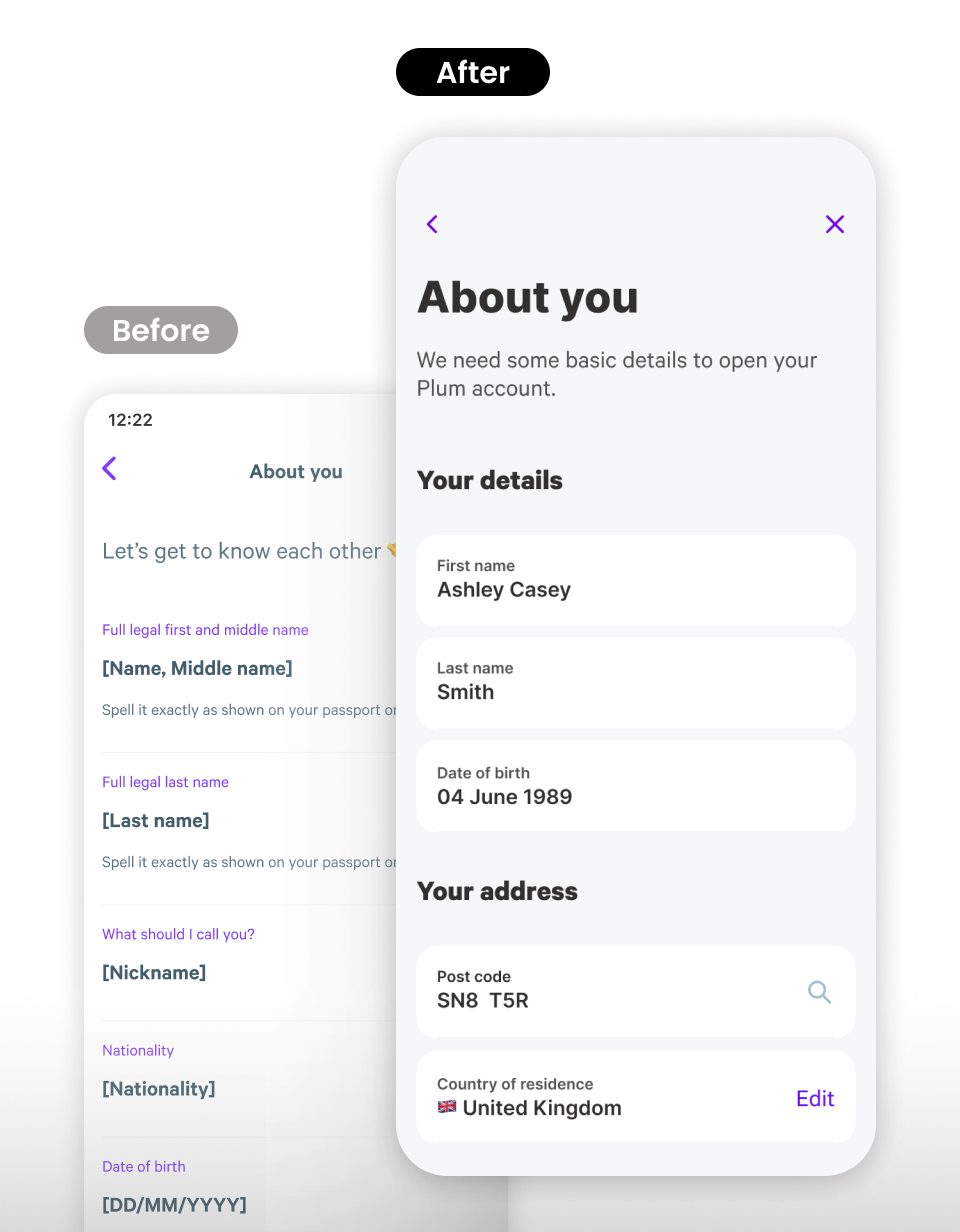
Personal details carried KYC requirements for 10+ products across UK and EU — each with different data demands. One form was trying to serve every regulatory regime at once.
Nearly doubled YoY across 10 markets. Every point of onboarding conversion directly impacted growth.
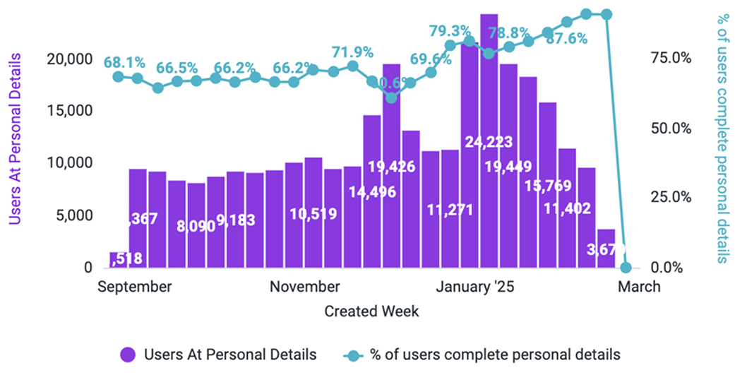
Personal details had a 42% error rate — the single biggest drop-off point in the entire onboarding funnel.
Surveyed across 3 channels. 17% cited unwanted direct debit, 16% cited complexity. Qual matched quant.
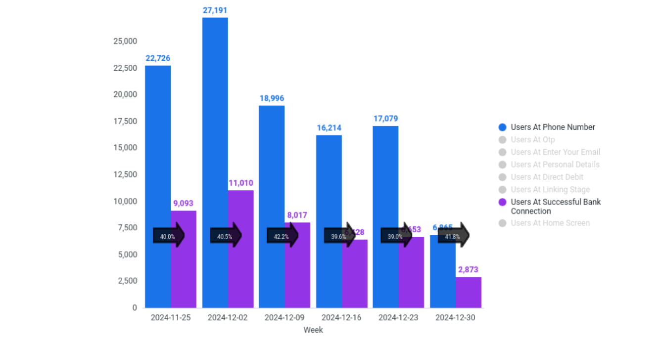
Blocked at account connection. Solving this represented 6,900–14,300 incremental conversions per month.
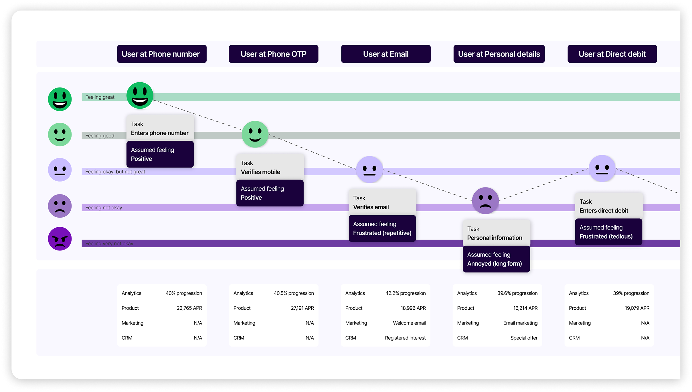
The data pointed to a single broken step, but the journey map revealed three distinct failure modes converging at the same point:
Emotional state mapped against each onboarding step, from sign-up to bank linking.
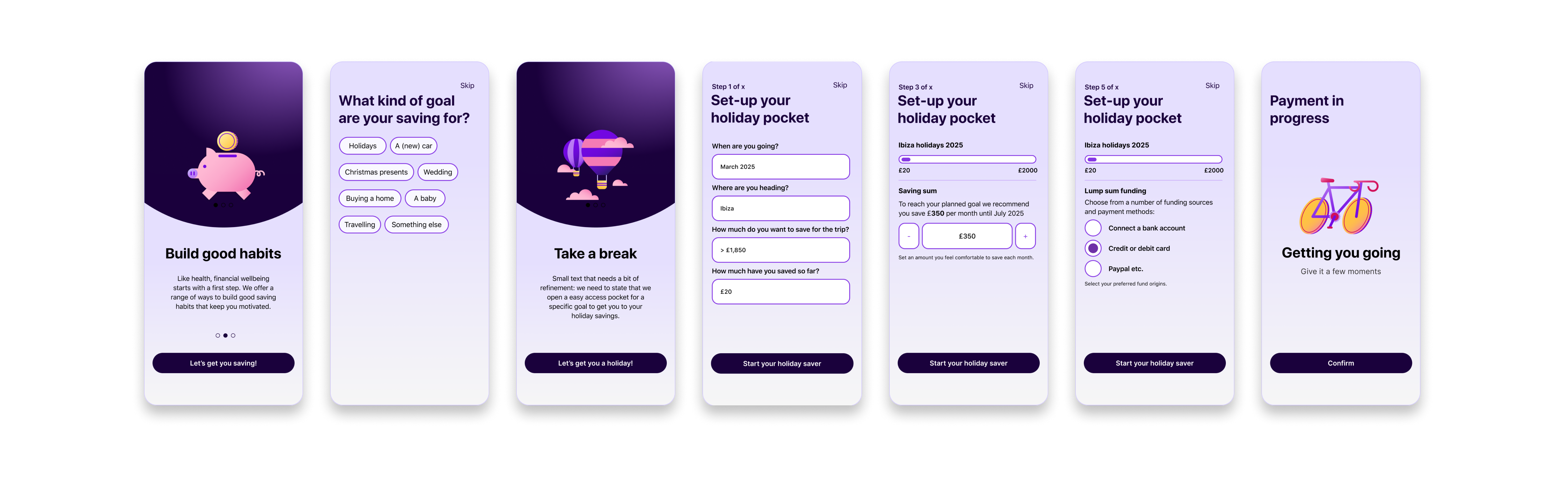
Consolidated fields, improved scan-ability with headlines, better input affordance and information grouping.
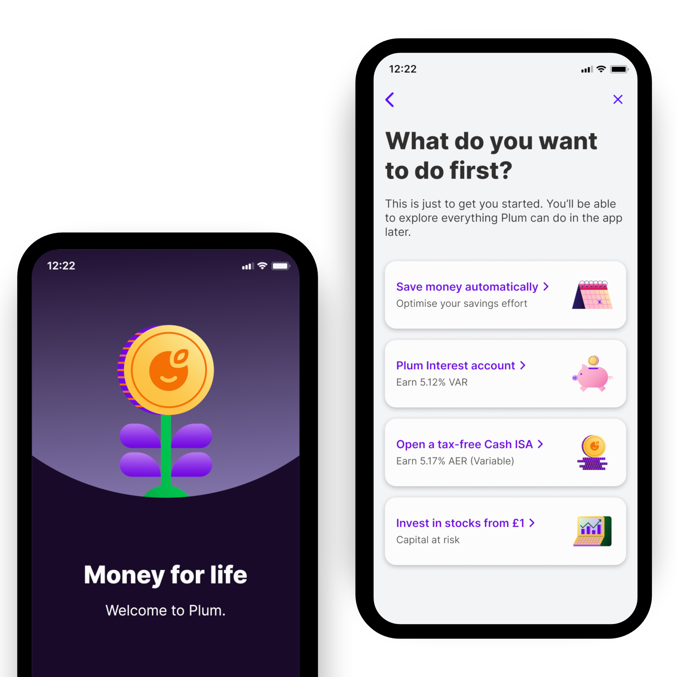
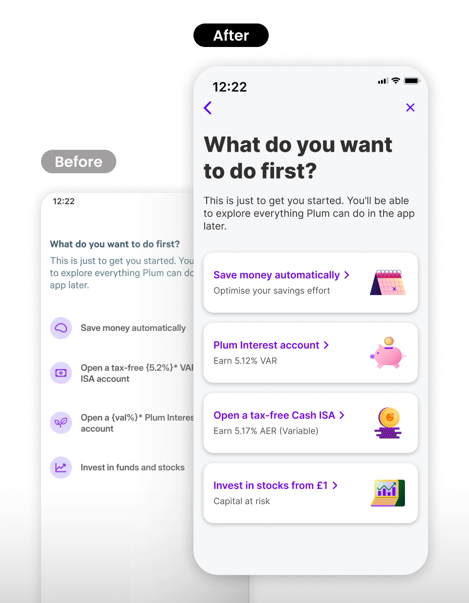
Moved earlier so users choose their product before committing. Clearer feature descriptions with card selectors.
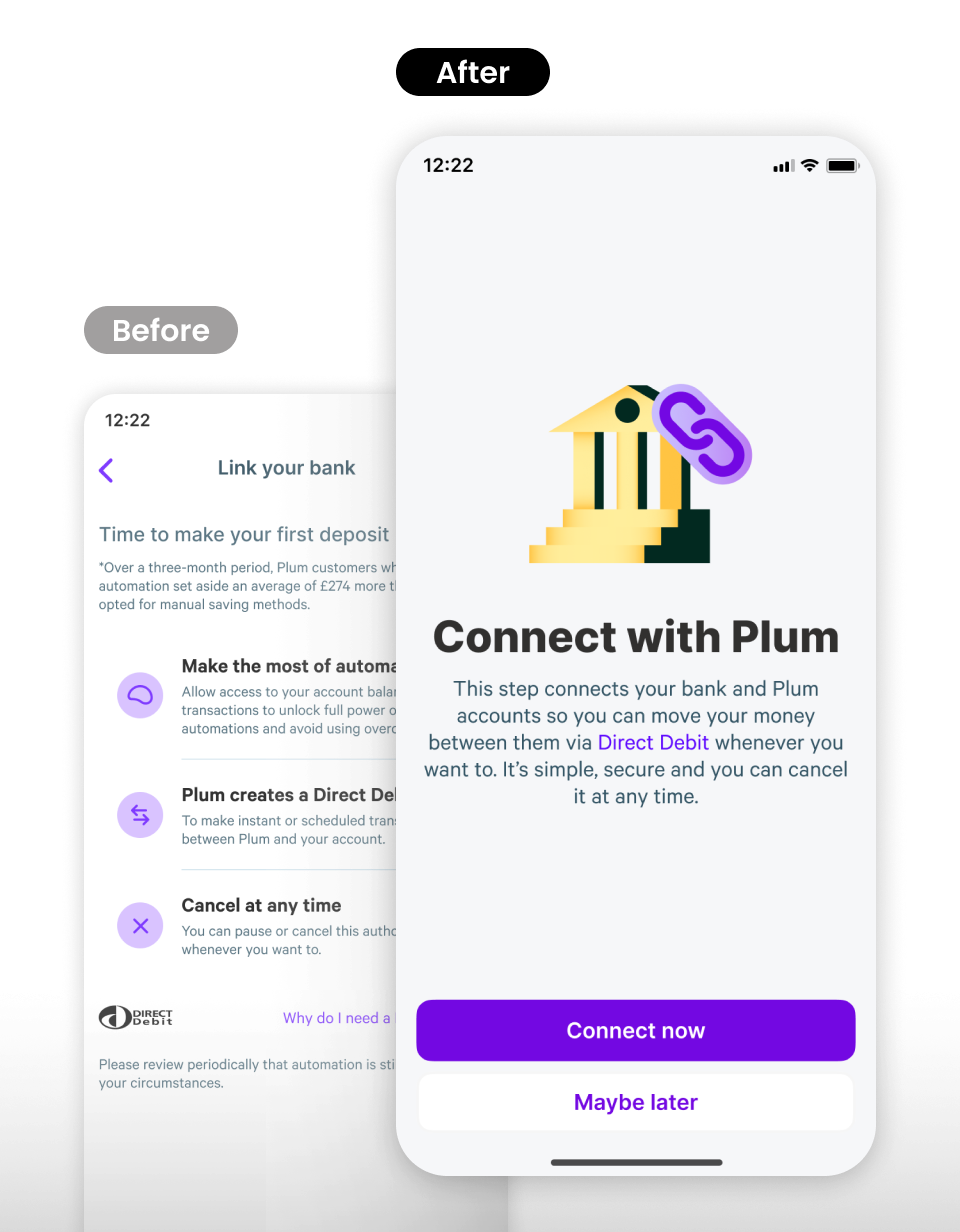
Removed bank linking as mandatory. Users who skip are guided through the home screen to complete at their own pace.
Personal details completion over a 6-month window (Looker)
Error rate on personal details nearly halved
Revenue per customer growth, contributing to £6.7M in 2024
End-to-end flow shipped across iOS & Android in all markets
The tactical fixes revealed a deeper pattern: users arrived with different goals and trust levels, yet the flow treated everyone the same. We separated the journey into two design problems — onboarding (identity, compliance, setup) and activation (reaching first value) — giving the team a shared language and each metric its own levers.
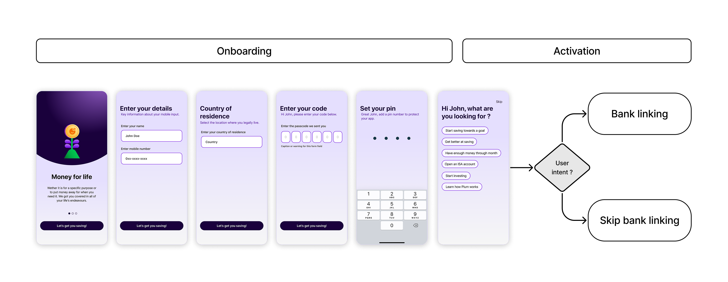
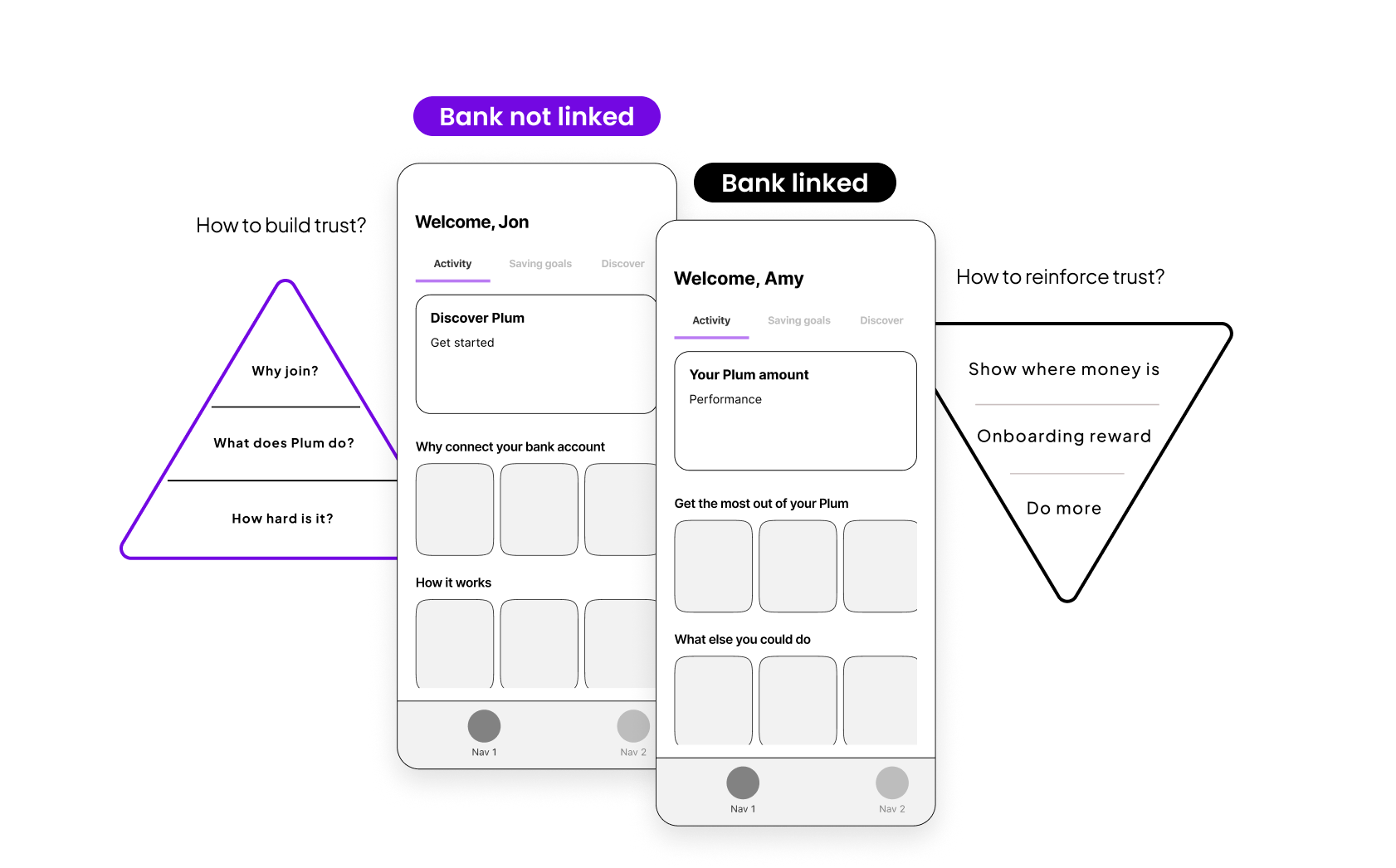
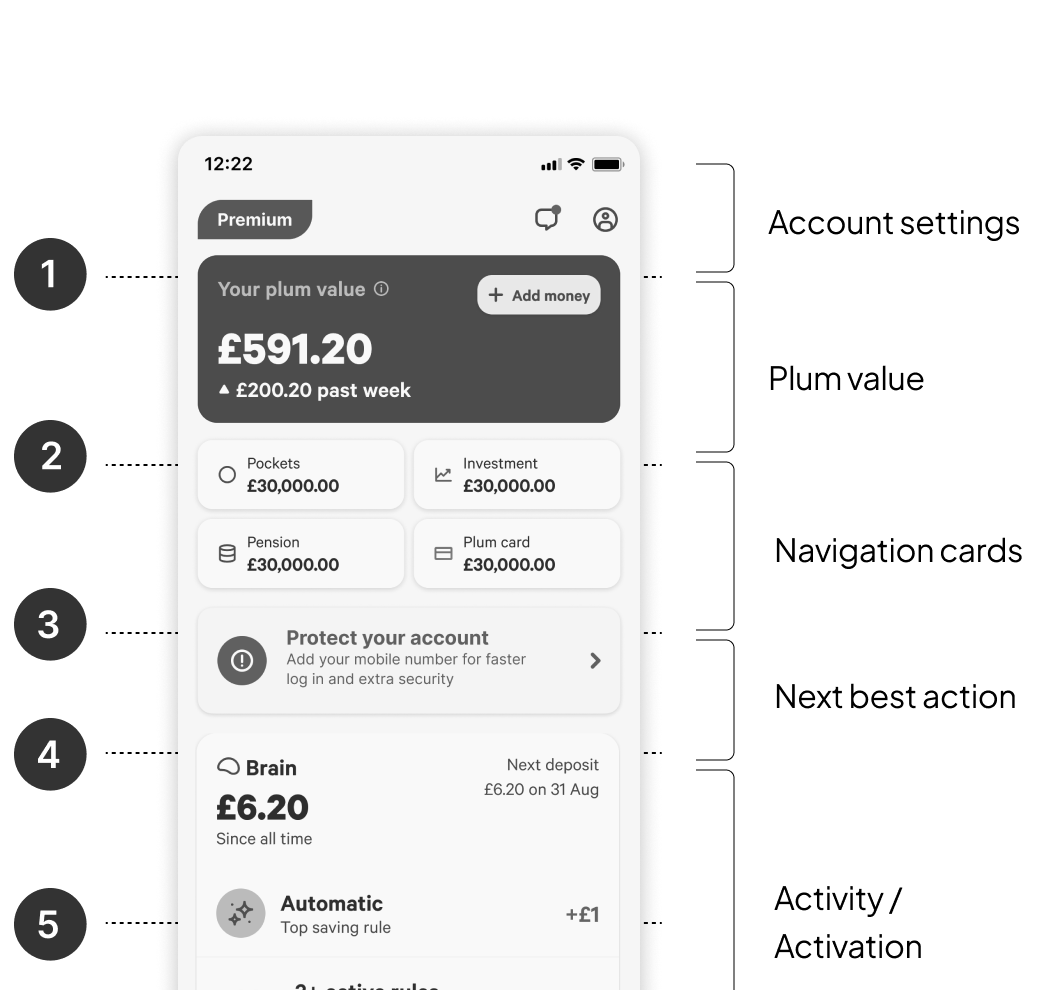
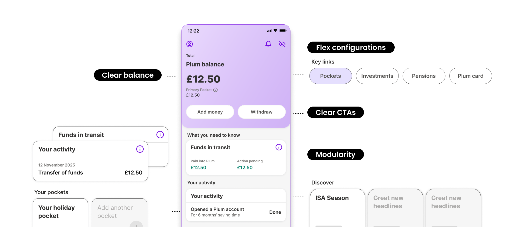
The home screen is every user's first landing after signup. It has to welcome, orient, and nudge toward the next meaningful action — but without modularity, there was no way to flex the experience by intent or trust level, and engagement was dropping off.
We restructured it around an inverted hierarchy of needs: see your money first, then discover more. It also needed to serve two trust states — users who linked their bank needed reinforcement, while those who skipped needed to build confidence from scratch.
The redesigned flow went live for 2M+ users on iOS and Android. By separating onboarding from activation and designing for intent, we extended the framework into financial product onboarding — the right product, at the right moment. Completion lifted 20 points, error rates halved, and the team had a durable model for future work.
Separating onboarding from activation gave the team two measurable problems instead of one vague funnel — and unlocked a 20-point completion lift.
The strategic reframe didn't come from a workshop — it came from fixing a broken form and noticing the pattern underneath. Tactical work is strategic work when you're paying attention.
Always open to conversations about product, design, and leadership.
Get in touch