Cutting operational
cost by 66%

Role: Product Design Manager
Client: Aviva
Time: 2023 (6 weeks)
Team: 1 Product Owner · 3 Engineers · 1 Designer

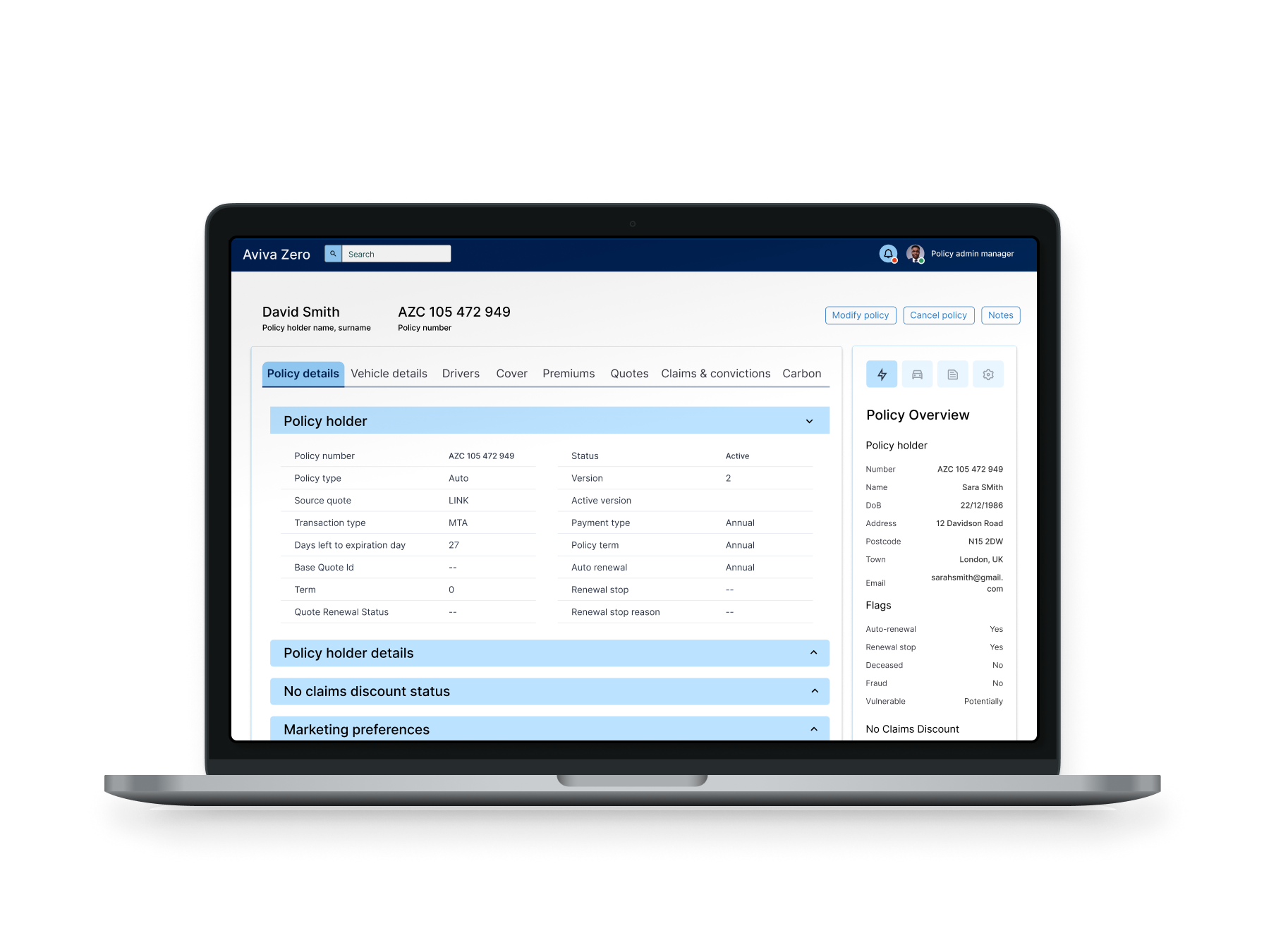
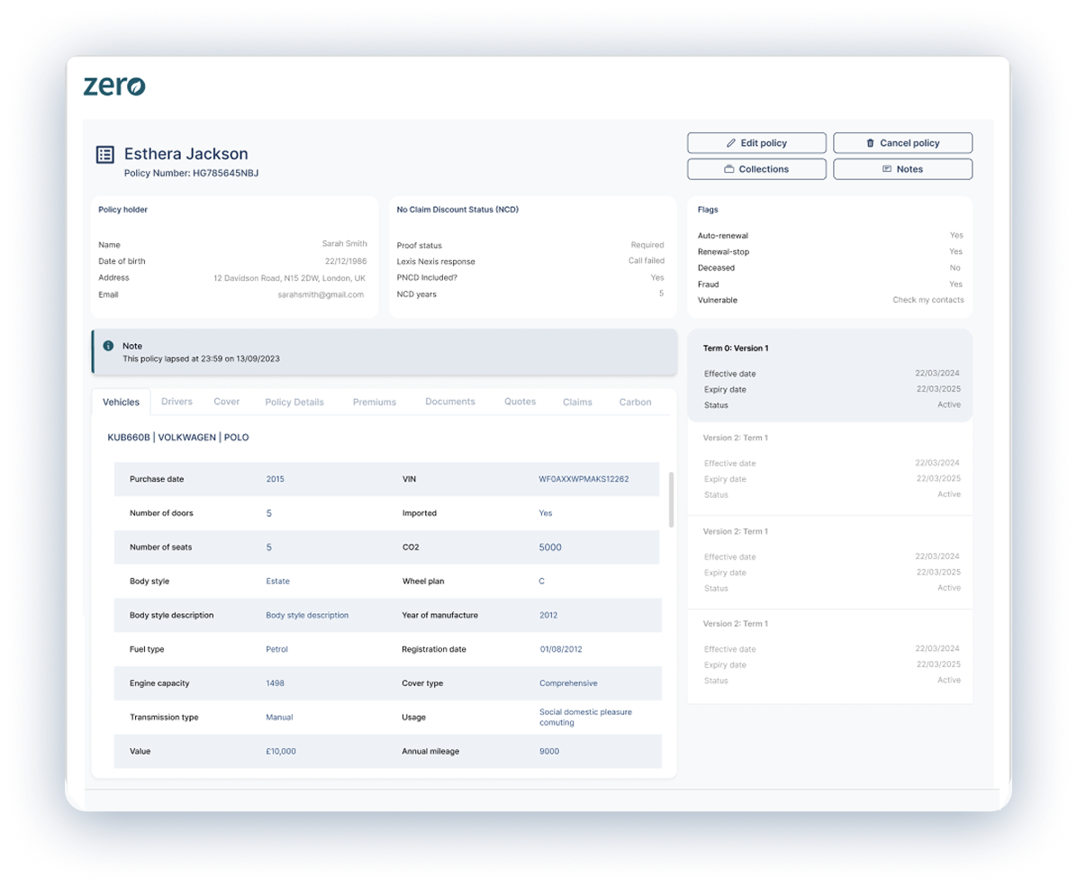
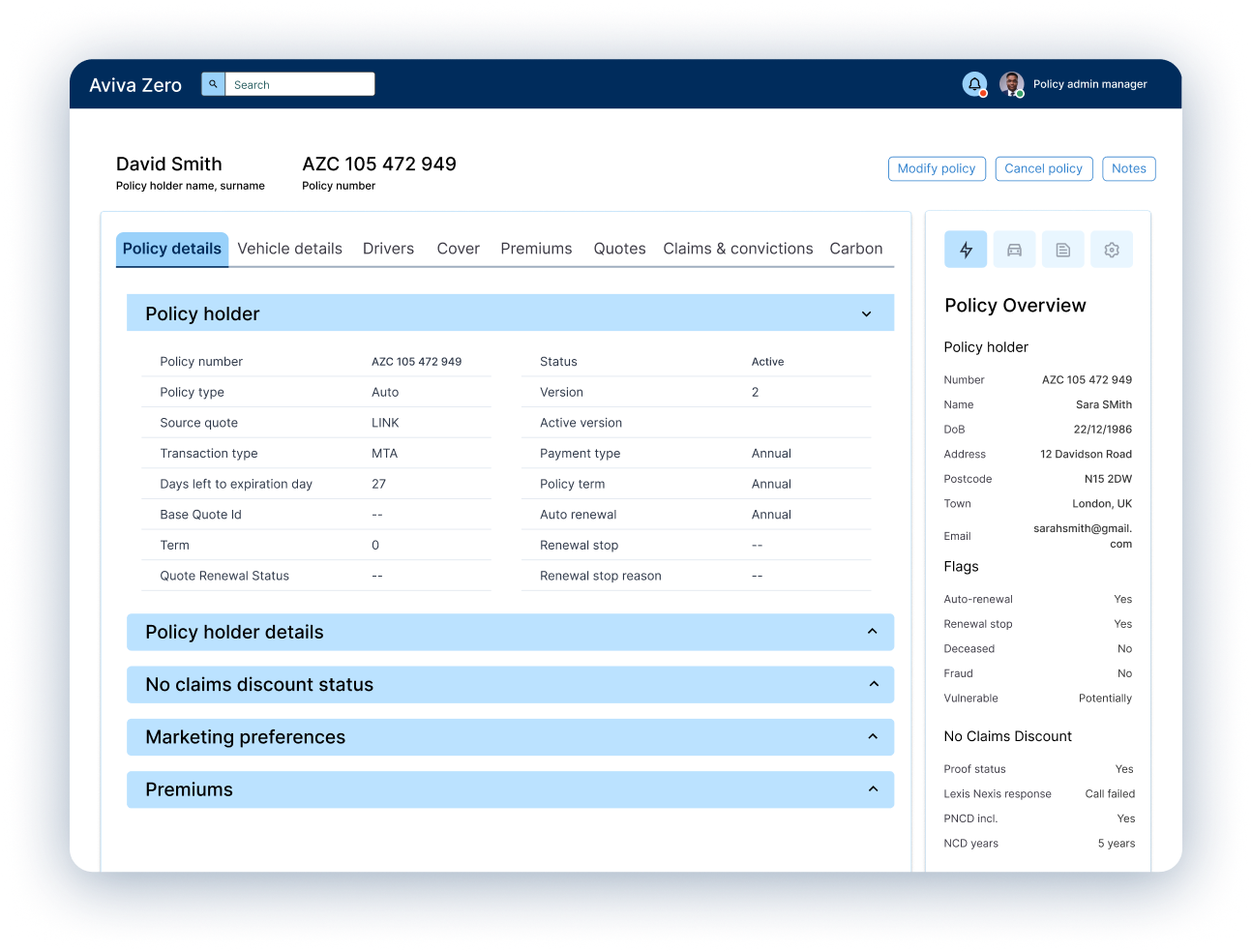
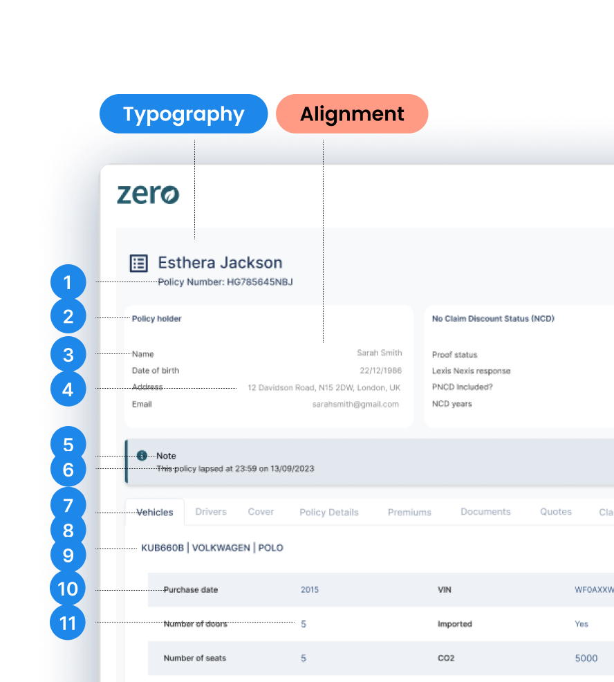
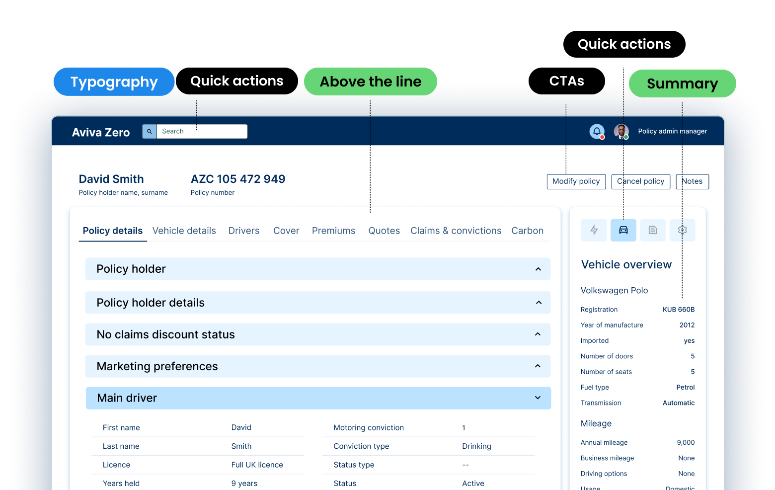
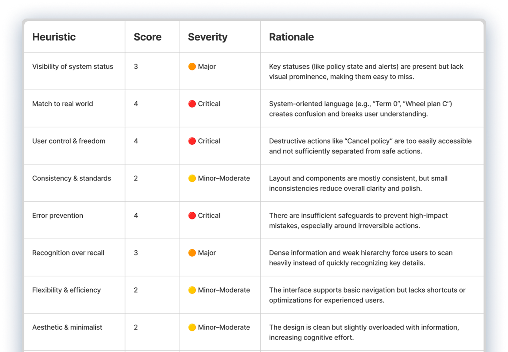
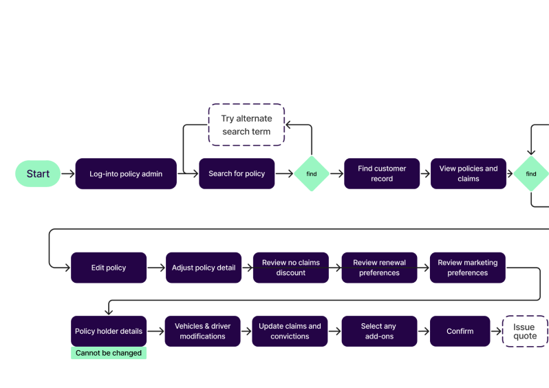
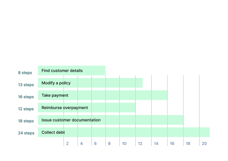
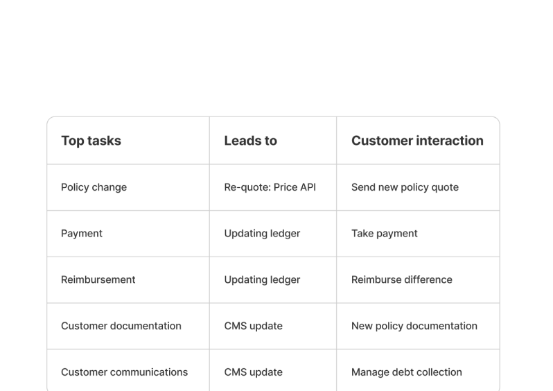
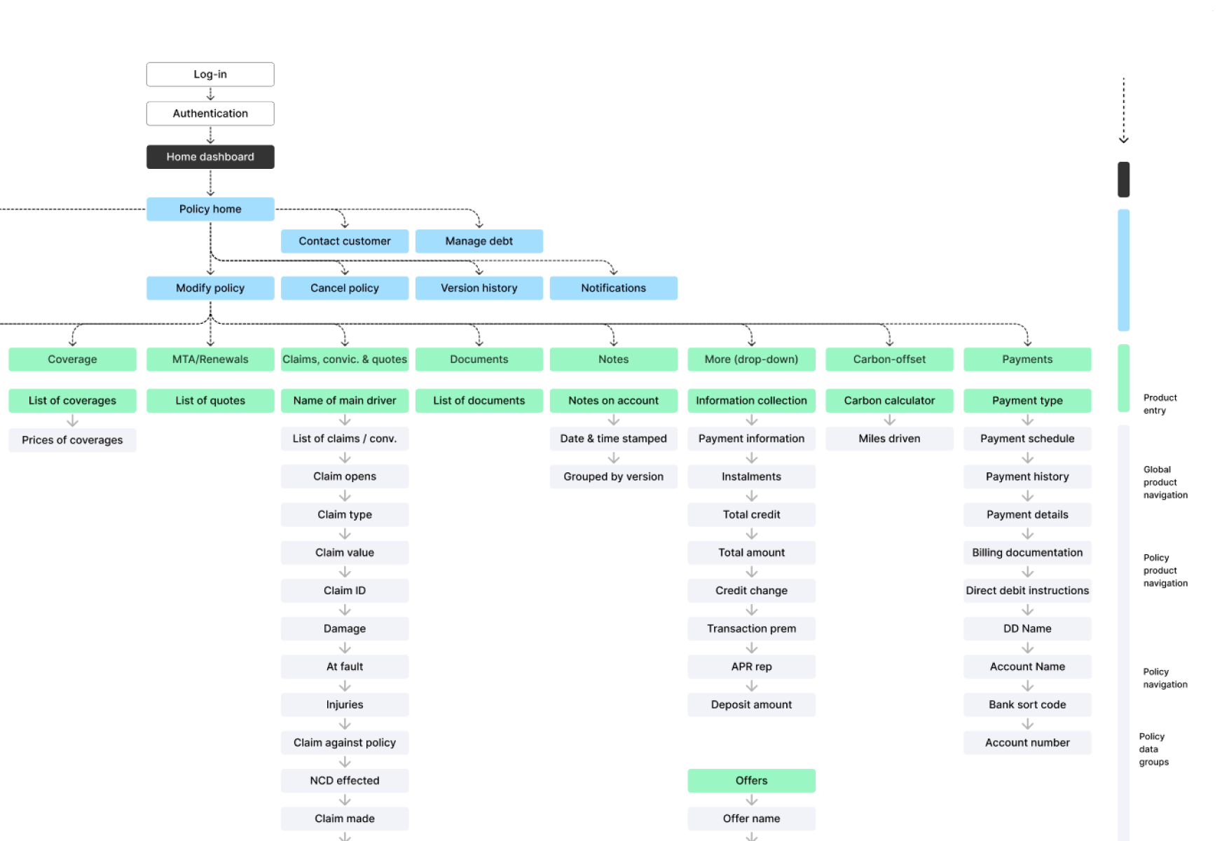
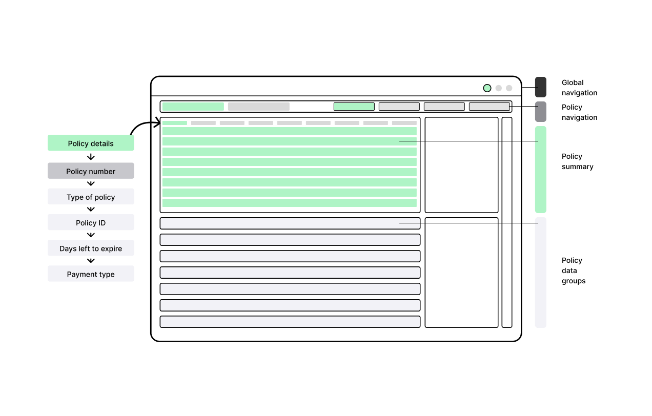
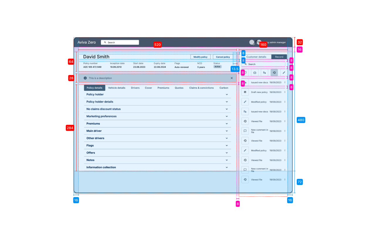
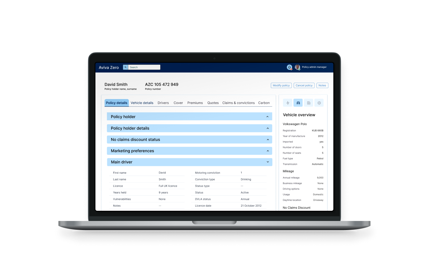
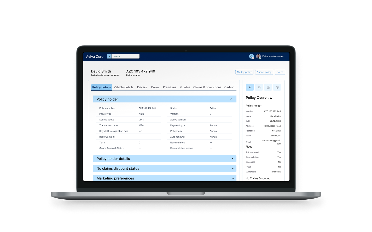
Aviva's internal policy admin system was slowing teams down — increasing operational costs and making everyday tasks unnecessarily complex. I led and managed the redesign of a core admin dashboard to simplify workflows, improve speed, and reduce cost at scale.

Aviva Zero policy admin dashboard — redesigned interface
Context
Key challenge
1 policy per hour

The workflow was long and repetitive, with unnecessary steps limiting productivity to just one policy update per hour.

Problem statement
13 steps

Policy admin managers needed 13 steps to complete a single core task.

Key results
13 → 4 steps

Redesigned UX reduced steps by 66%, enabling faster task completion and improved service efficiency.

Impact
66% reduction

Streamlined workflows cut operational effort and costs across high-frequency policy tasks.

Existing dashboard

The original interface had grown organically — with little concern for UX efficiency

Before — original Zero policy admin interface

New dashboard

The new interface provided clear hierarchy, consistent grid, decision-driven layout

After — redesigned Aviva Zero dashboard

Before

11 different type treatments, alignment and spacing issues added significant cognitive load

Before — typography and alignment issues

After

With consistent typography and spacing, a cleaner layout accelerated interactions

After — improved typography, quick actions, CTAs, summary
Approach
Understanding the As-Is

Framing the opportunity

We started with a heuristic analysis to baseline the experience. What we found wasn't just poor UI — it was systemic complexity embedded in the product.

  1. 1. Visibility of status
  2. 2. Match between system & real world
  3. 3. User control and freedom
  4. 4. Consistency & standards
  5. 5. Error prevention
  6. 6. Recognition rather than recall
  7. 7. Flexibility & efficiency of use
  8. 8. Aesthetic and minimalist design
  9. 9. Recover from errors
  10. 10. Help & documentation
Heuristic evaluation table — scoring severity across 10 usability heuristics

Key task flow

13 steps to modify a single policy. Observational research showed the most common task took well over an hour, in part due to the convoluted workflow in the existing tool.

Task flow diagram — 13 steps to modify a policy

Steps per action

Most common workflows required 10+ steps. A simple retrieval of customer information took 8 steps of user interactions.

Bar chart — average steps per admin action

Top task outcomes

All top tasks in the existing tool led to policy document updates, meaning finding a customer record was usually followed by updating policy details.

Table — top tasks all lead to policy document updates
From insights to actions

Redesigning the information system

I reframed the experience around Jobs-to-be-Done, focusing on the primary task: → Modify a customer policy quickly and accurately

From there, I:

  • Reconstructed task flows based on real user behaviour
  • Removed obsolete or duplicated steps
  • Grouped data based on decision-making needs (not backend structure)

This led to a new information architecture that:

  • Reduced cognitive load
  • Surfaced key actions earlier
  • Enabled faster decision-making
New information architecture — grouped data by decision-making needs
Dashboard wireframing exploration

Reduce journey steps

A quick wireframe study showed we could group relevant information and complete the main job-to-be-done of modifying a policy in fewer steps.

Wireframe showing information grouping and sequencing

Detailed wireframes

Data groupings were tested in various arrangements to optimise shortcuts and layout. Spacing and page rhythm between the information grouping accelerated time-to-task.

Detailed layout mark-up of the redesigned dashboard
Result

Shipped and operational

The new UI was implemented within 8 weeks of the study conclusion. The new UX saved Aviva hundreds of thousands of operational costs.

Final redesigned Aviva dashboard — policy details view Final redesigned Aviva dashboard — policy overview view
Key learnings
Design the system, not the screen

Enterprise UX problems are rarely interface problems — they are workflow and system problems. By redesigning the task architecture, not just the UI, we unlocked a 66% reduction in operational cost.

Impact
Challenge the workflow, not just the layout

Real impact came from questioning why 13 steps existed in the first place — removing unnecessary steps and aligning the product to how people actually work, not how the system was originally built.

Interested in connecting?

Always open to conversations about product, design, and leadership.

Get in touch