Designing AI-driven
financial guidance
for 2M+ users

Role: Staff Product Designer (sole design lead)
Company: Plum
Time: 2024–2025
Team: 1 Product Manager · 3 Engineers · 1 Data engineer · 1 Staff Designer

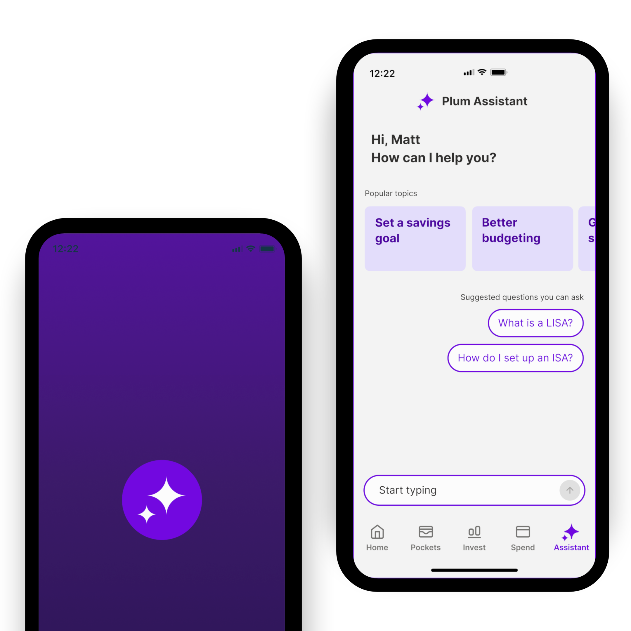
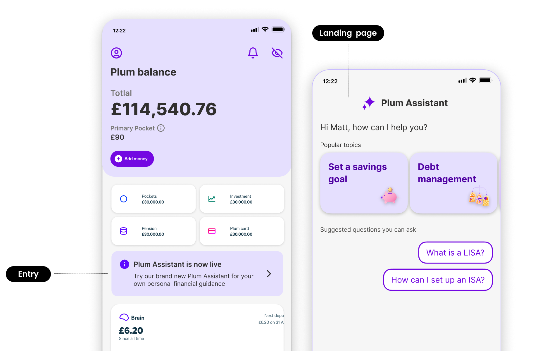
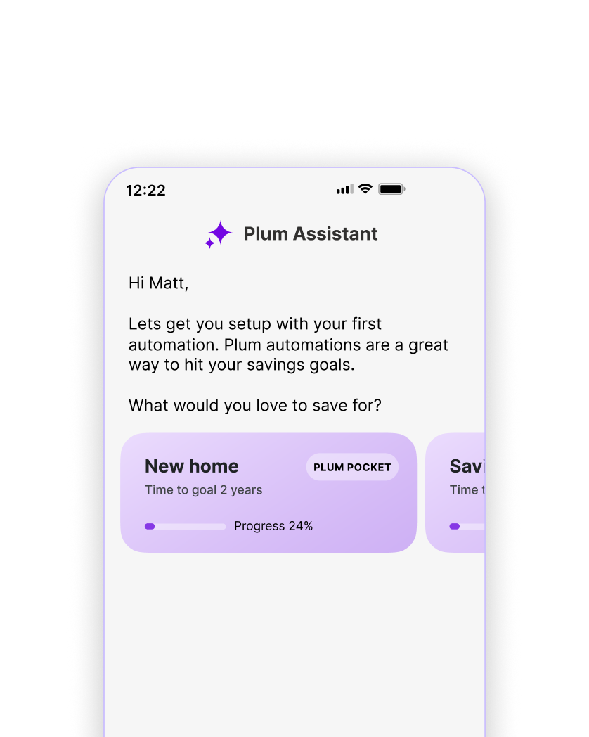
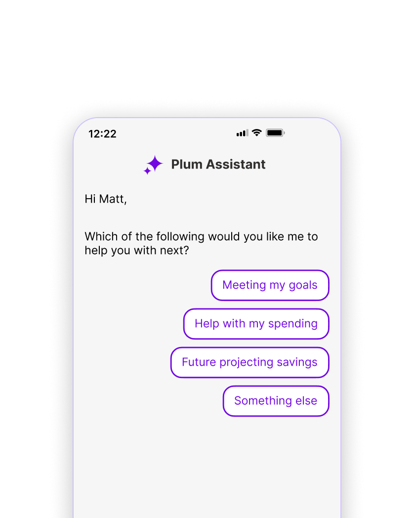
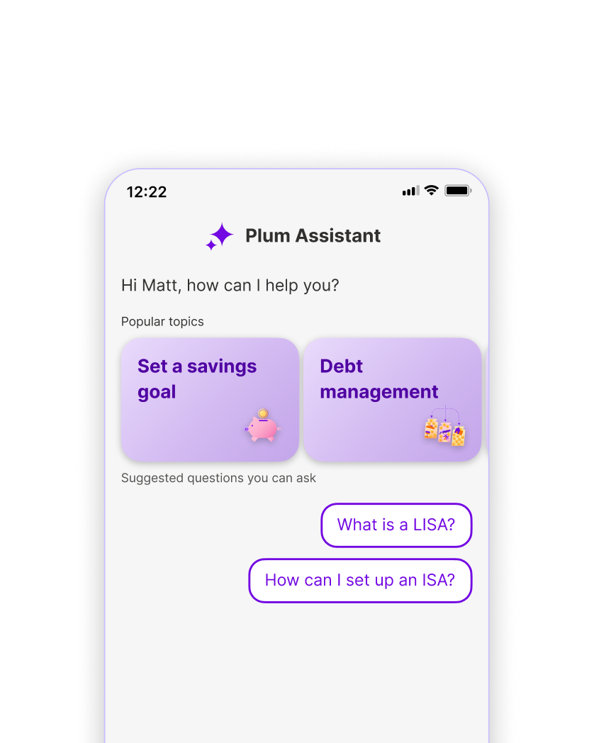
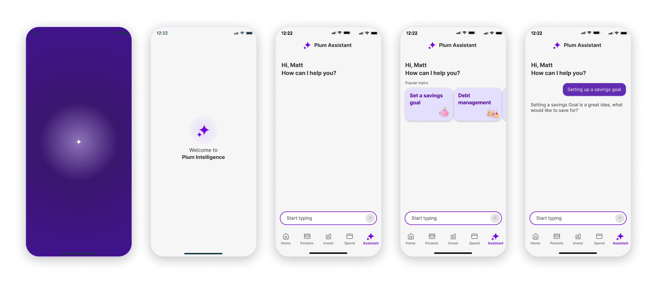
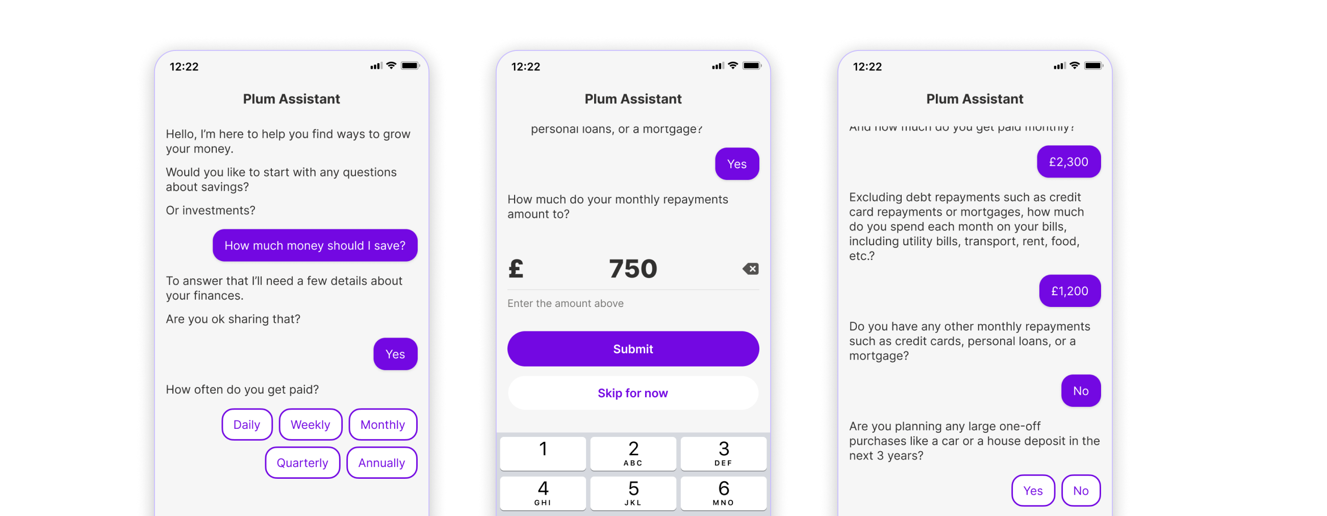
Plum needed an AI assistant that could guide people through financial decisions — personally, at scale, within regulatory constraints. I led the end-to-end design, from strategy to shipped product.

Plum AI assistant — conversational financial guidance interface
Context
Market context
13M UK adults

Sitting on cash they could invest — a big underserved market with clear appetite for guidance.

Problem statement
£430B trapped

In low-return cash — eroded by inflation and pulled out of UK capital markets.

Opportunity
70% knowledge gap

“Lack of knowledge” is the #1 barrier to investing — yet our survey showed clear appetite for guidance.

Plum’s bet
Customer adoption

Can an AI conversational layer turn that appetite into action?

Sources: Barclays Prosper (2024) · Social Market Foundation (2024) · FCA Cash Savings Review (2023)

Approach
Defining the opportunity

How might we design a conversational AI to help nudge towards financial actions

We approached compliance as a design principle, not a limitation — embedding it into the architecture to unlock the rest of the solution.

We started with both market research and a clear view of our regulatory constraints, using each to inform and balance the other. This led to a financial guidance decision tree, designed to route conversations using clear, rule-based thresholds.

Financial guidance decision tree — 4 gates (emergency fund, risk attitude, loss capacity, time horizon) routing to personalised outcomes, with compliance gate between attitude and capacity
Design Principles
Regulation
Guide, don’t advise

Stay within FCA boundaries while ensuring guidance remains clear and actionable.

Trust
Build credibility progressively

Help users understand their options and make informed decisions themselves.

Complexity
Use context,
not repetition

Adapt responses based on user input to reduce friction and cognitive load.

Scale
Personalise
through routing

Deliver tailored guidance consistently using structured pathways.

Experience entry
First version

Discovery and entry

The assistant launched via the home screen callout and a dedicated tab in the main navigation. The landing page welcomed users by name, surfaced popular topics, and offered suggested questions.

  • Entry via home screen banner vs. dedicated nav tab — we tested both for first-touch rates
  • Curated topics over open input — reducing blank-screen paralysis
  • Personalised greeting by name — building personalisation before asking for trust
Discovery and entry — home screen entry point and Plum Assistant landing page with popular topics and suggested questions
Design approaches
Card based nudges

Contextual cards that surface relevant goals and products within the conversation — making guidance tangible and immediately actionable.

Card-based nudges — savings goal cards embedded in conversation
Pre-defined suggestions

Structured option sets that guide the conversation forward — keeping users in control while ensuring responses stay within compliant pathways.

Pre-defined suggestions — multiple choice options for guided conversation flow
A combination of both

The landing experience blends both patterns — topic cards for discovery, suggested questions for quick entry — meeting users wherever their intent sits.

Combined pattern — topic cards and suggested questions on the assistant landing page
What shipped

The first-time experience, end to end

From launch animation to first guided conversation in under 30 seconds. The sequence builds trust progressively — branded moment, personal greeting, curated topics, then a natural entry into dialogue. Every screen earns the next tap.

First-time experience flow — splash screen, welcome, assistant landing with topic cards, and first guided conversation
Interaction patterns
Design approaches
Card based

Structured cards for surfacing product information and recommendations — scannable, tappable, and easy to act on without reading long text responses.

Card-based approach — structured product cards with clear CTAs
Design approaches
Text-based chat bubbles

Conversational responses with clear typographic constraints — 32 characters per line max, left-aligned when wrapping — optimised for readability at speed.

Text-based chat bubbles — spacing specs and character limits for readability
Design approaches
PDQ based

Pre-defined question flows for collecting financial context through structured, compliant interactions — reducing ambiguity while keeping the experience conversational.

PDQ-based approach — structured question with selectable answer options
User research
Usability & comprehension testing

30 participants · February 2025

Discovery

58%

Could locate the assistant entry point in 5 seconds

Usability & comprehension testing

30 participants · February 2025

Intent

78%

Could articulate a real question they’d actually ask

Results
Company revenue
£6.7M

Nearly doubled year-on-year in 2024 (Public · CBInsights)

Assets under management
£1B+

AUM tripled year-on-year, crossing the billion mark (Public · Press)

Revenue per customer
+40%

Year-on-year growth in average revenue per customer (Public · Press)

Data quality
80% reduction

In faulty attribution signals — enabling reliable, data-driven product decisions (Internal)

Shipped product

The full conversation flow in production

From initial greeting through to a complete financial profile — the guided questionnaire progressively collects income, goals, and risk appetite using PDQs, structured inputs, and contextual follow-ups. Each question earns the next, staying on the right side of the guidance-to-advice boundary throughout.

Final shipped UI — three screens showing the complete conversation flow from greeting through financial data collection to personalised guidance
Impact
Shipped during Plum’s fastest growth year

Led end-to-end design across iOS and Android, partnered with Product and Data Science on AI messaging, and ran value-first guidance workshops — shipping v1 while exploring conversational AI as the primary interface.

Key learning
Design the system, not the interface

The real craft was in the conversation architecture — the decision tree, the regulatory guardrails, the guidance-vs-advice boundary with legal. The UI was straightforward once those decisions were made.

Interested in connecting?

Always open to conversations about product, design, and leadership.

Get in touch