Reducing operational costs by 2/3
A CRM admin dashboard, 2023
Aviva sought to replace their existing policy admin system, which slowed down tasks and incurred expensive operating cost. The business goal was to build a new policy admin dashboard, supported by a faster data model and a better UX for admin staff to complete jobs to be done at speed.
Client Aviva Insurance, UK
Role Product Design Manager
Team 1 Product owner, 3 developers, 1 designer
Time 6 weeks 2023
Key results
New UX architecture informed the UI layout. All journeys were user tested. Successful implementation and roll-out across the internal tool for policy admin users.
Impact
Reducing a workflow down from 13 to 4 steps only cut down operational cost of 2/3rds. That is ~66% which amounts to over half of the typical customer policy management tasks.
Learnings
A key learning from this project was around the inherit complexity of large enterprise software and how it can negatively affect the UX. Being able to build new software that meets people's needs can make all the difference for operational efficiency.
The approach
Starting out we audited the existing interface. There were many UX challenges, such as varying type sizes, issues with the hierarchy of information architecture, and no clear CTAs. Most notable observations were:
No grid
11 variations of type treatments
Spacing and alignment inconsistency
System visibility is low
CTAs have too low a contrast
User research
Using observational methods of user research we mapped out the as-was user flow for the various use cases. Based on the existing task flow of a policy manager, the team uncovered several obsolete steps based on overly complicated product architecture.
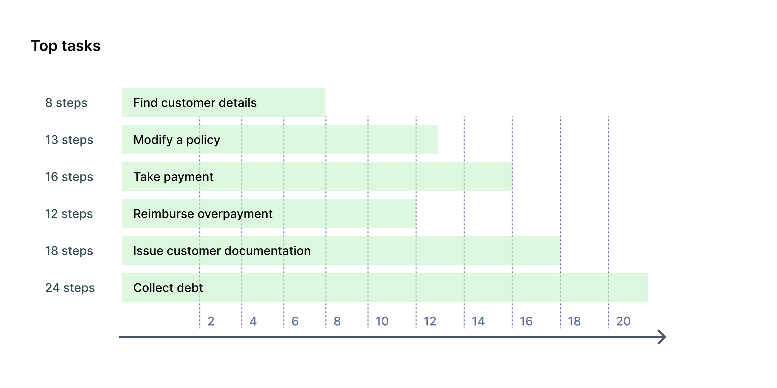
Top tasks and jobs-to-be-done
Our user research focused on task analysis, specifically the Jobs-to-be-done framework to optimise user flows and human-computer-interaction.
Information architecture and task flows
Learning from the observational studies we could map out the business logic in new task flows. This helped us identify a new information architecture which structured key tasks, reduced cognitive load and got to key interactions faster.
Reduce journey steps
A quick wireframe study tested how we could complete the main job-to-be-done of modifying a policy in fewer steps. Optimising the UX allowed us to measure a reduced time-to-completion from 13 steps to just 4.
Apply information architecture
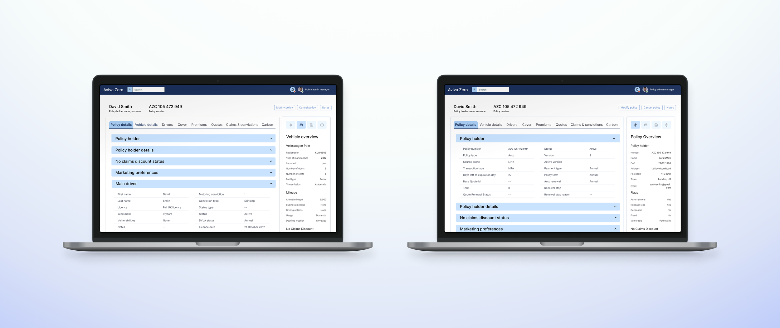
The new information architecture informed the UI layout.
Detailed wireframes
Data grouping were tested in various arrangements to optimise shortcuts and layout.
High-res UI layout visuals
The new UI was implemented within 8 weeks of the study conclusion. The new UX cut down the task flow of an average insurance policy manager by 2/3rds and saved Aviva hundreds of thousands of operational costs. The client was happy, the team was proud, especially the design team was happy to have seen such impact.


